
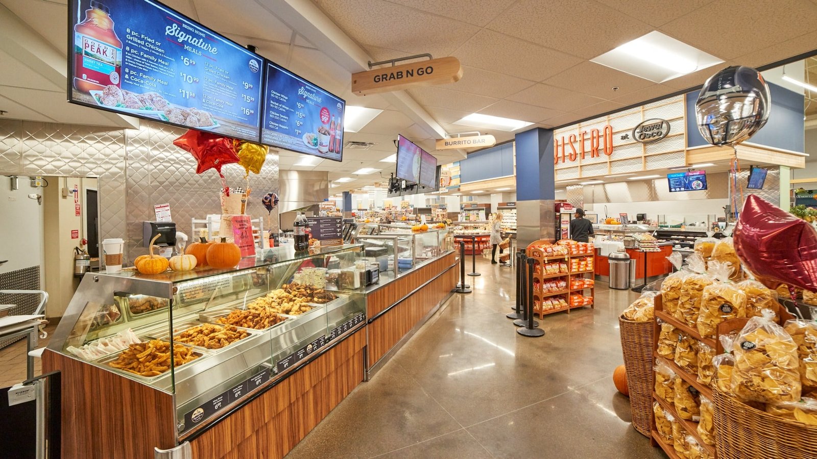
Grab & Go
Clear overhead signage and organized prepared-food counters make quick meal options easy to find and shop.
VIEW BRIEF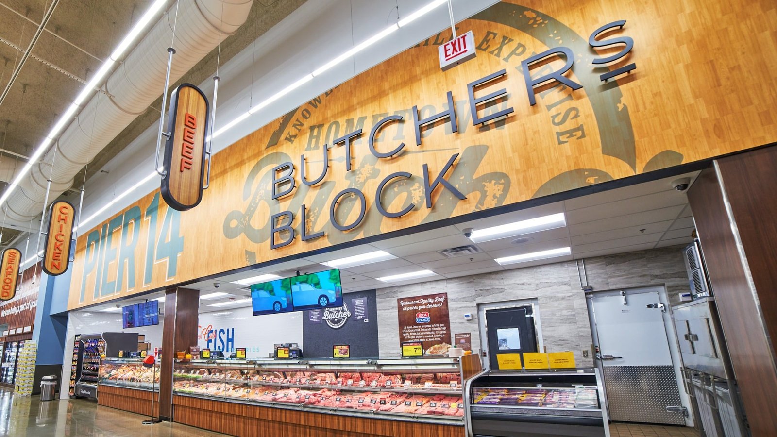
Butcher Block
Prominent dimensional lettering and warm wood graphics establish the butcher counter as a major fresh-food destination.
VIEW BRIEF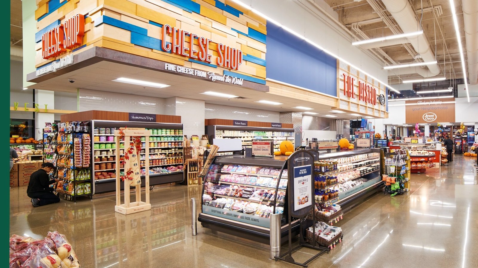
Cheese Shop
Bold dimensional signage and layered wood details turn the cheese department into a distinct specialty destination.
VIEW BRIEF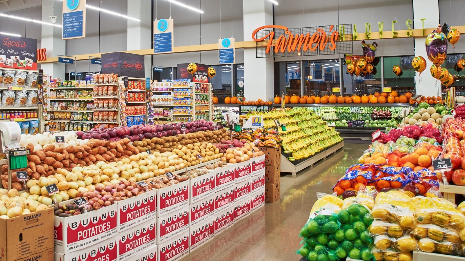
Farmer’s Harvest
Bright signage and open produce displays create an energetic fresh-market destination within the urban store.
VIEW BRIEF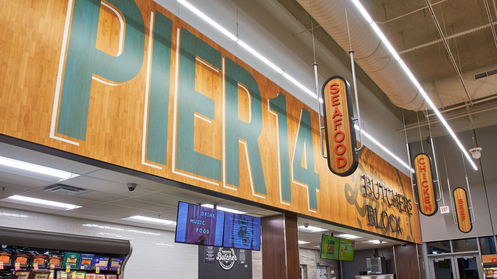
Pier 14
Large-scale environmental graphics and hanging category signs clearly define seafood, chicken, and beef within the fresh-food area.
VIEW BRIEF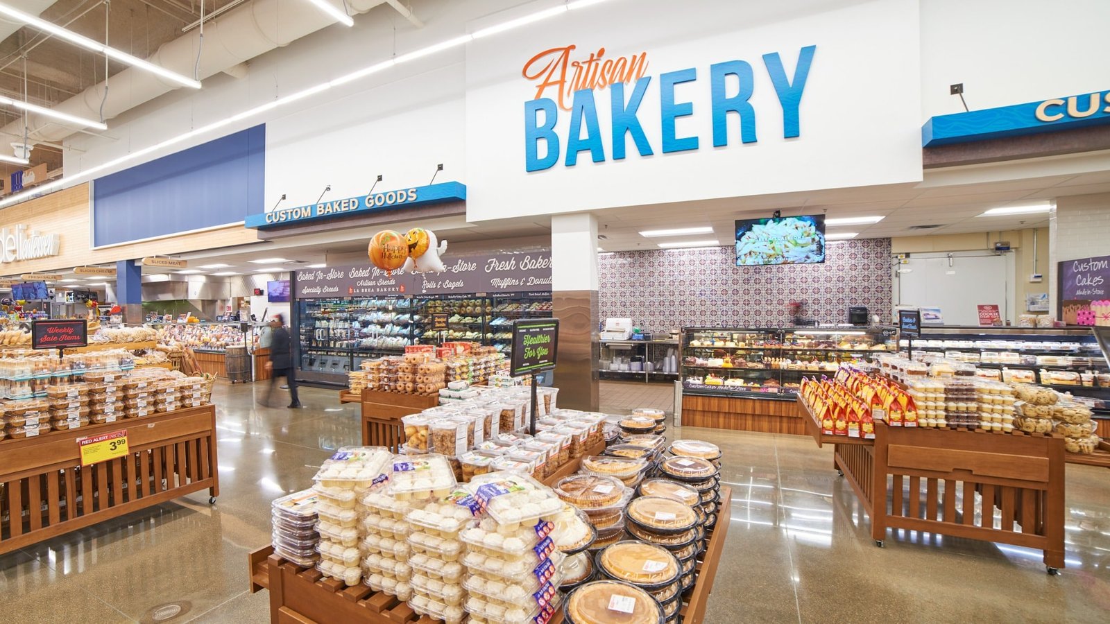
Artisan Bakery
Oversized bakery graphics, patterned tile, and abundant merchandising give the department a bright, premium presence.
VIEW BRIEF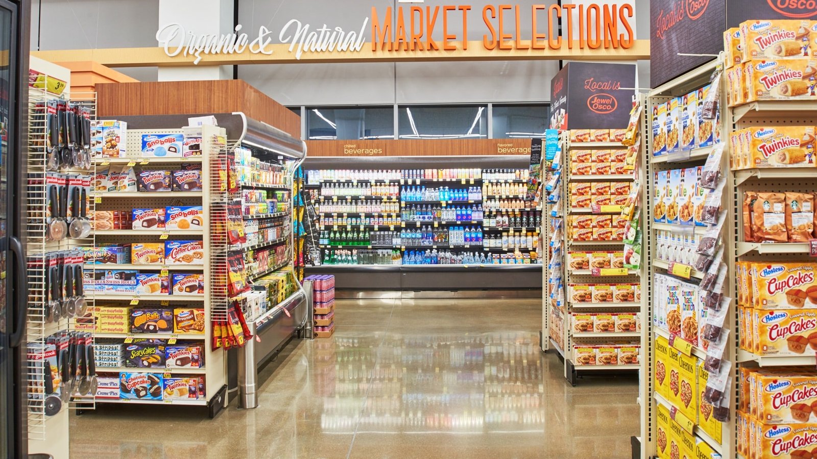
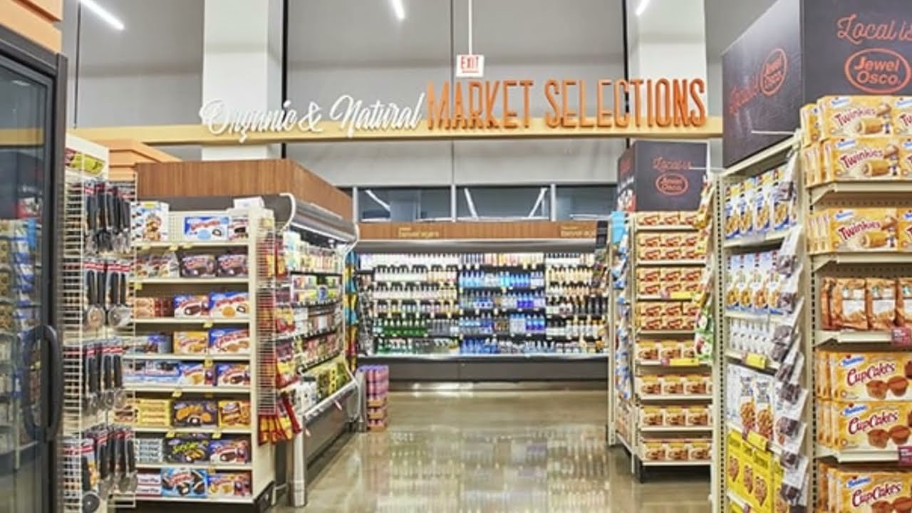
Market Selections
Custom signage gives the organic and natural assortment a distinctive identity within the broader grocery environment.
VIEW BRIEF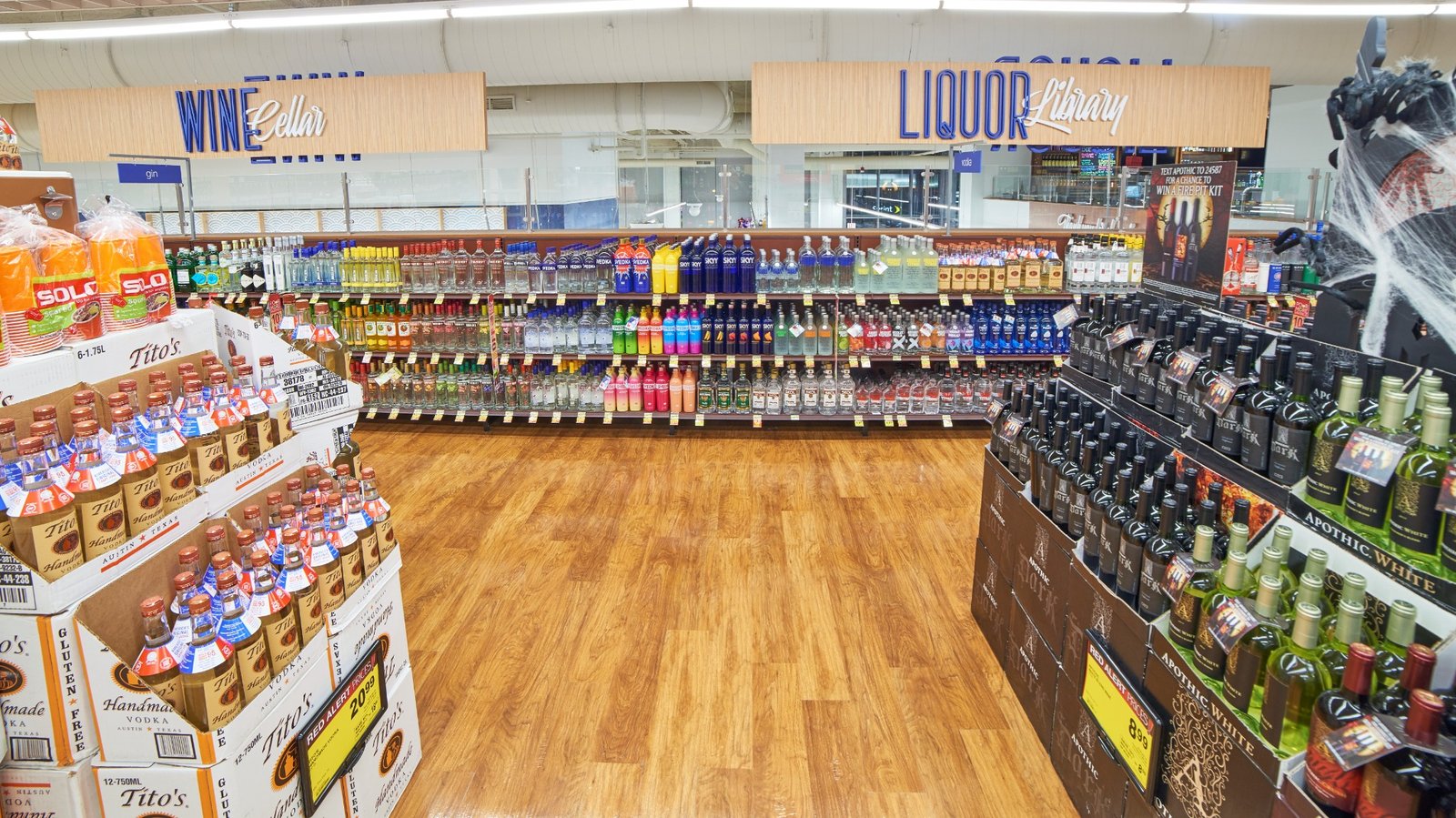
Liquor Library
Custom overhead signage gives wine and spirits their own distinctive destination within the premium grocery environment.
VIEW BRIEF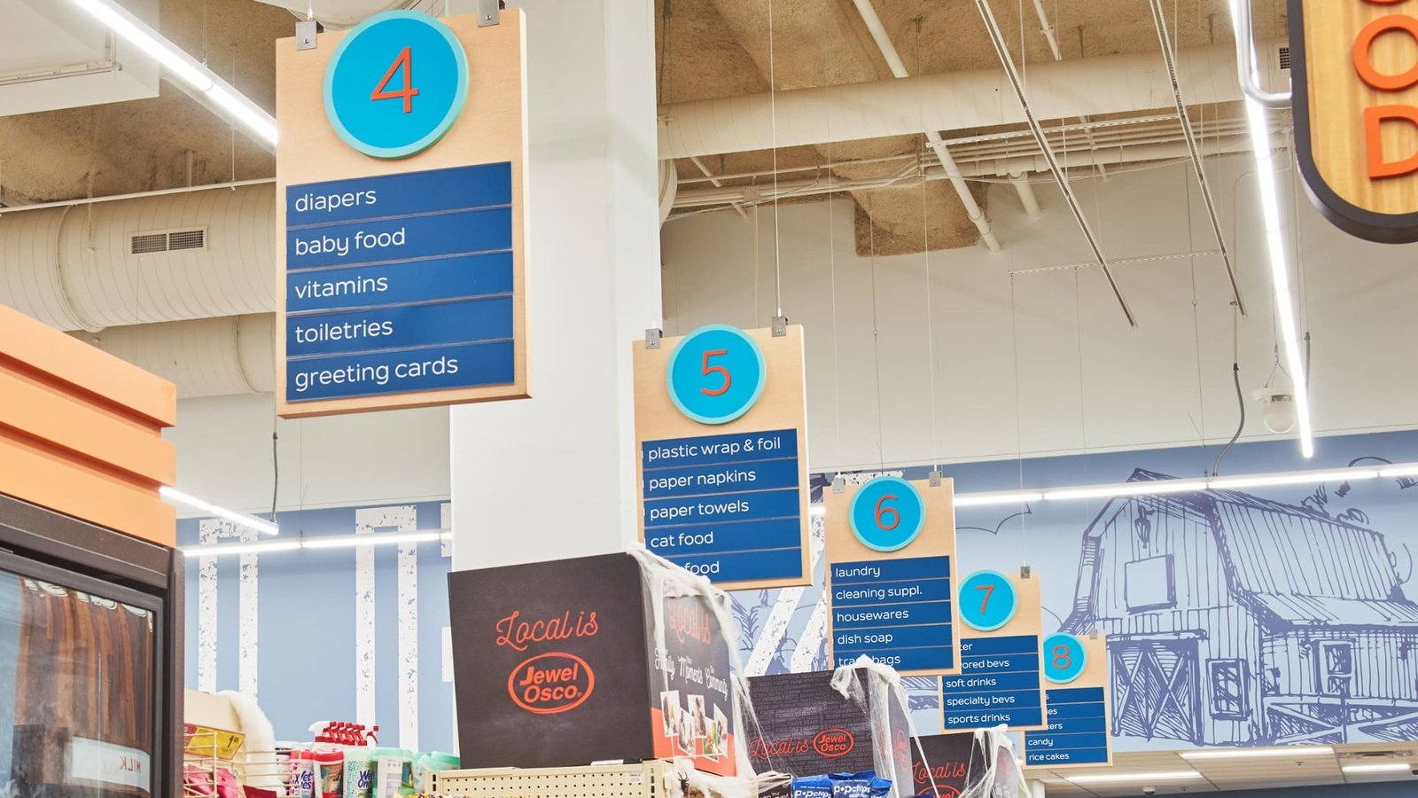
Aisle Wayfinding
Colorful suspended aisle markers make grocery categories easy to locate while reinforcing the store’s graphic design language.
VIEW BRIEF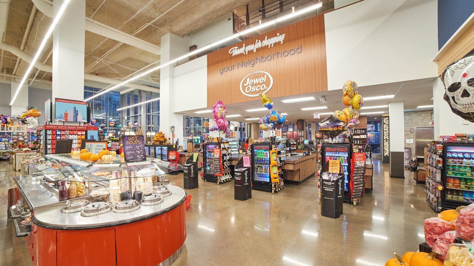
Neighborhood Hub
A large neighborhood message anchors the front end and reinforces the store’s role as a community destination.
VIEW BRIEF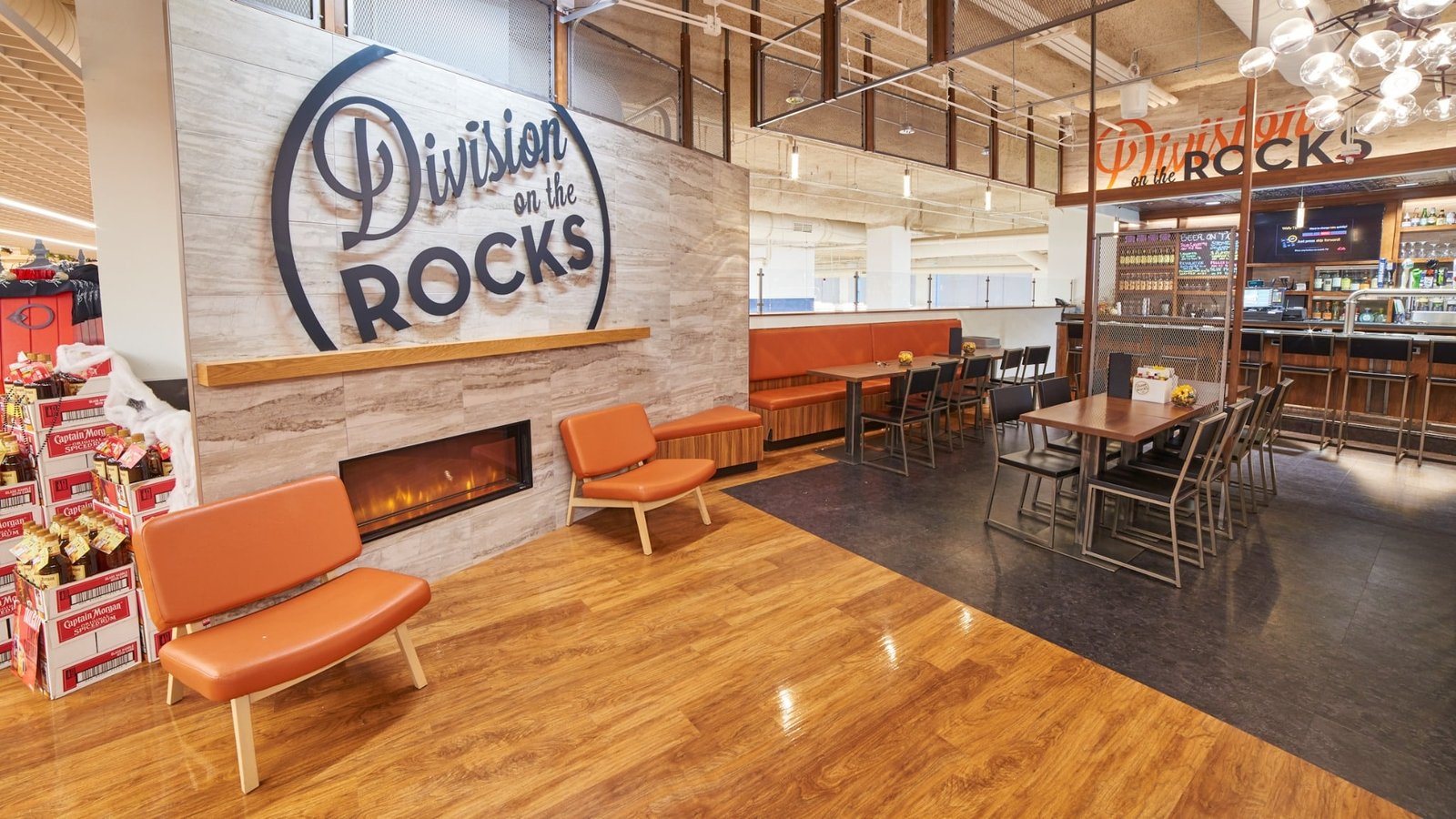
Division Lounge
Warm finishes, lounge seating, and the full-service bar create a gathering place connected to the store’s prepared-food experience.
VIEW BRIEF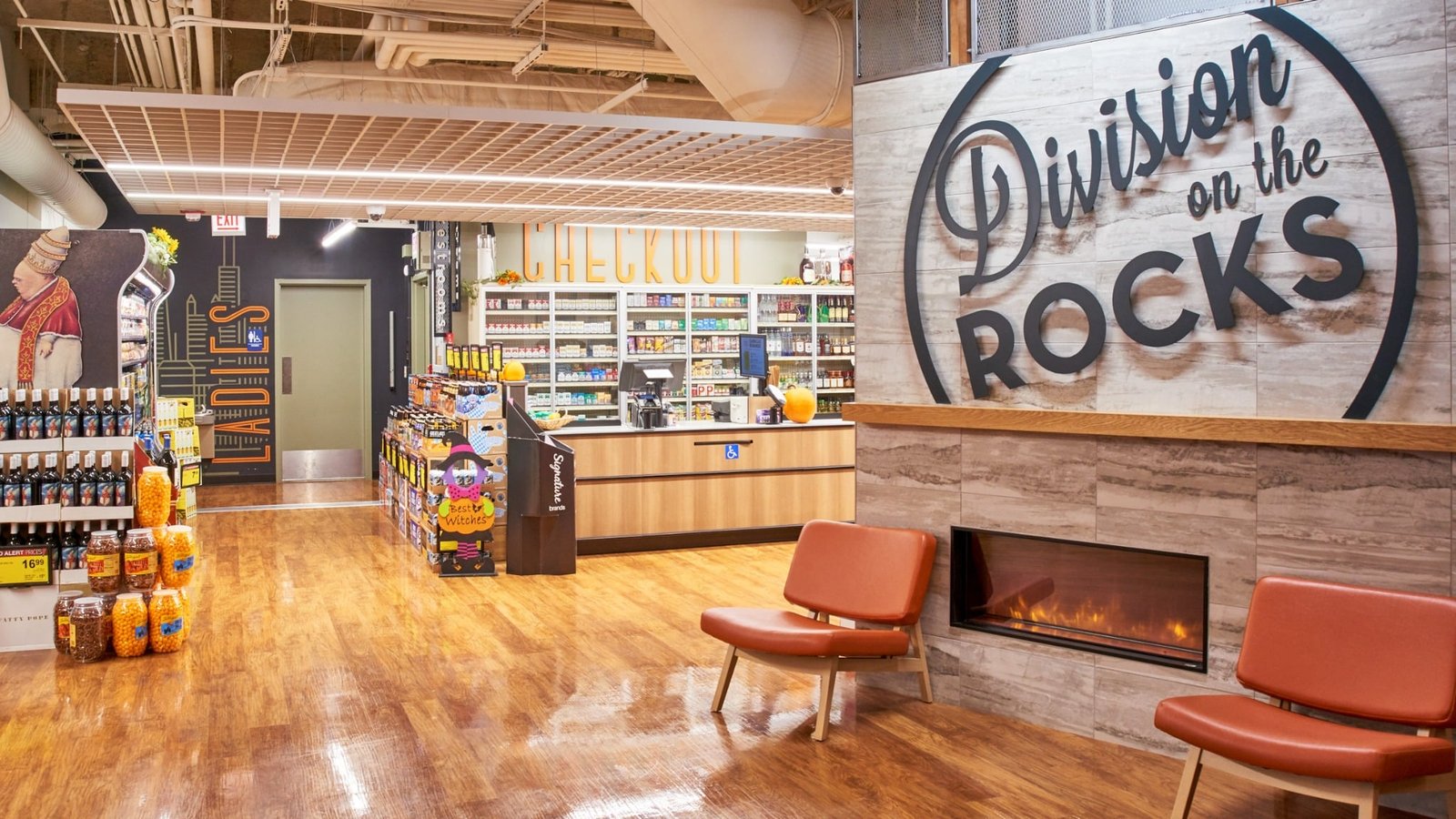
Lounge Arrival
A fireplace, comfortable seating, and bold Division on the Rocks branding introduce the store’s dedicated bar and lounge experience.
VIEW BRIEF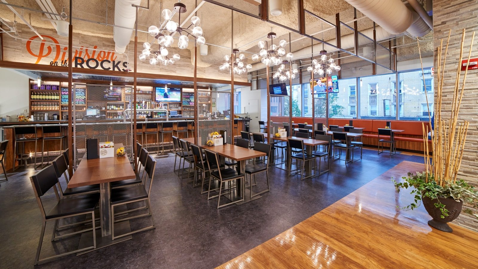
Bar & Dining
Open seating, decorative lighting, and a full-service bar transform the mezzanine into a neighborhood dining and social space.
VIEW BRIEF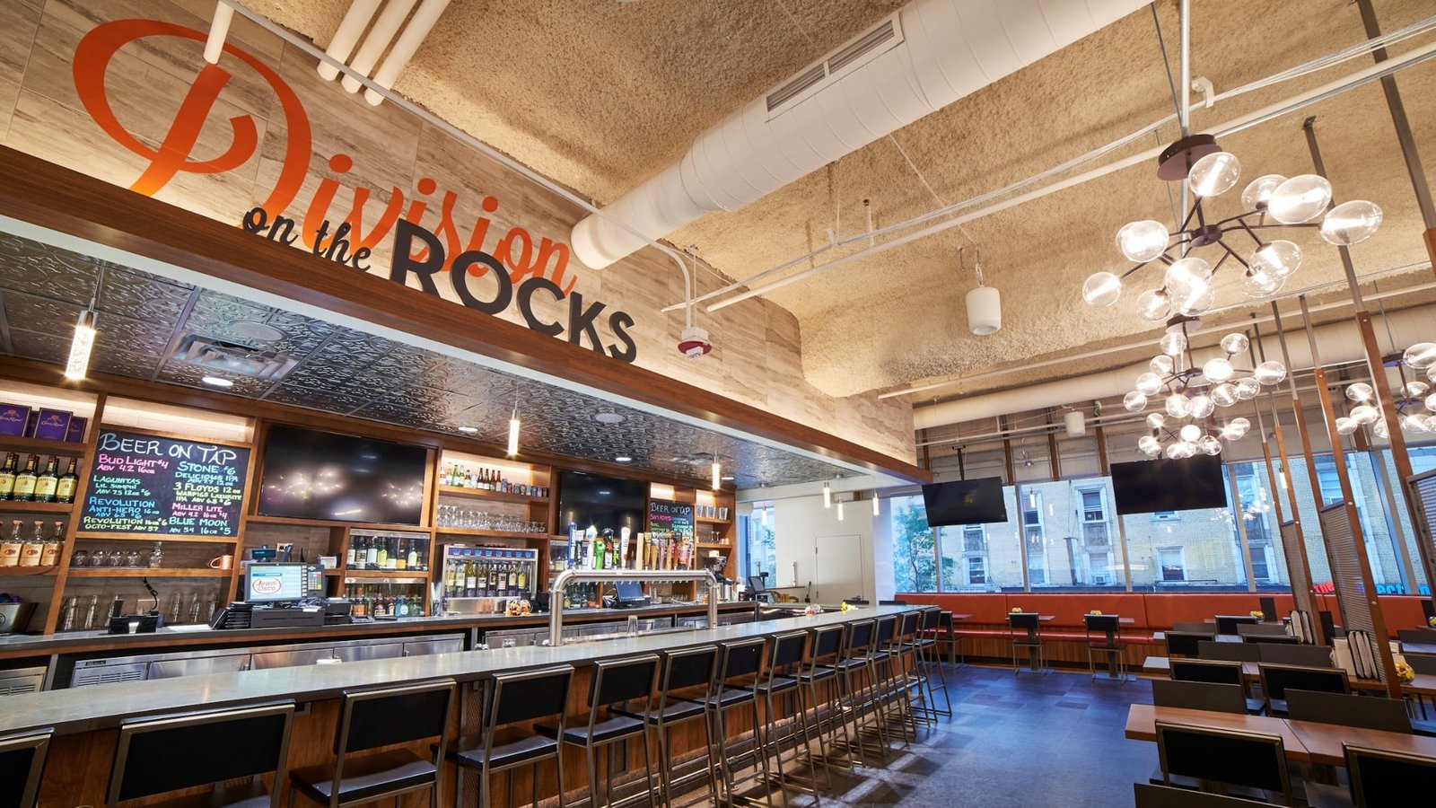
Bar Interior
A long service bar, warm wood finishes, and distinctive lighting give Division on the Rocks a polished neighborhood gathering-place atmosphere.
VIEW BRIEF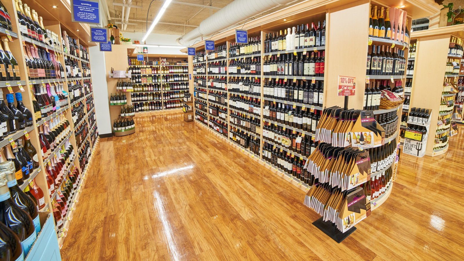
Wine Aisles
Warm wood fixtures and organized category signage create an inviting environment for browsing the store’s extensive wine selection.
VIEW BRIEF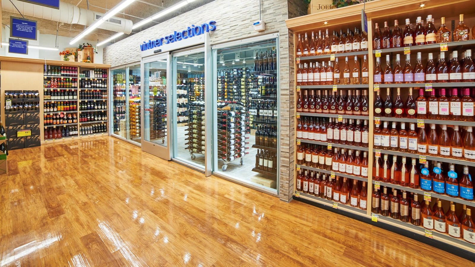
Wine Selections
A clearly branded entrance and extensive bottle displays give the wine department a polished specialty-store feel.
VIEW BRIEF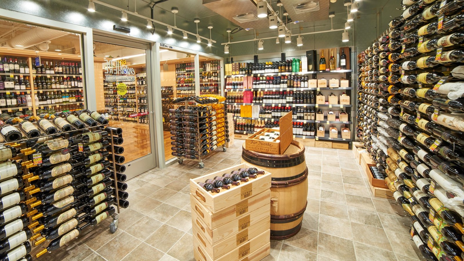
Wine Room
Dedicated wine merchandising and enclosed displays create a more specialized experience within the store’s beverage offering.
VIEW BRIEF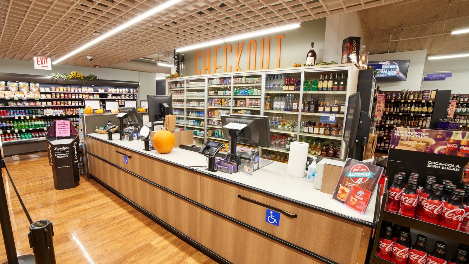
Checkout Zone
Warm wood finishes and oversized checkout graphics give the front end a clean, contemporary identity.
VIEW BRIEF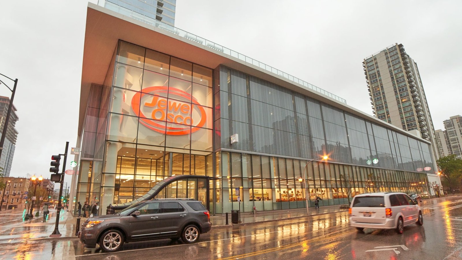
Urban Exterior
The Jewel-Osco storefront integrates into its high-profile downtown setting with expansive glazing and prominent brand signage.
VIEW BRIEFTHE BRIEF
The graphic and fresh take on this Ultra-Premium package made specifically for ACI’s Pavilions store made it naturally adaptable to other stores. With the help of KRS, the package was applied to the ultra-urban Chicago Jewel-Osco store. Most of the elements stayed the same for the Jewel-Osco store with the addition of a bar/lounge area on the open mezzanine level. Division on the Rocks is a full-service bar with ordering service from the grocery store’s deli and prepared foods. The Jewel-Osco store is in a high-profile location in downtown Chicago and attached to a housing facility.
KRS wanted to bring the community together in a neighborhood destination. This store was an existing facility where the architecture for the store was predetermined. KRS faced the challenge of figuring out how to fit all of these store-within-a-store elements in the pre-existing architecture.
A walkthrough of the Jewel-Osco store in downtown Chicago, emphasizing the adaptation of the Ultra-Premium package in an urban grocery context.