
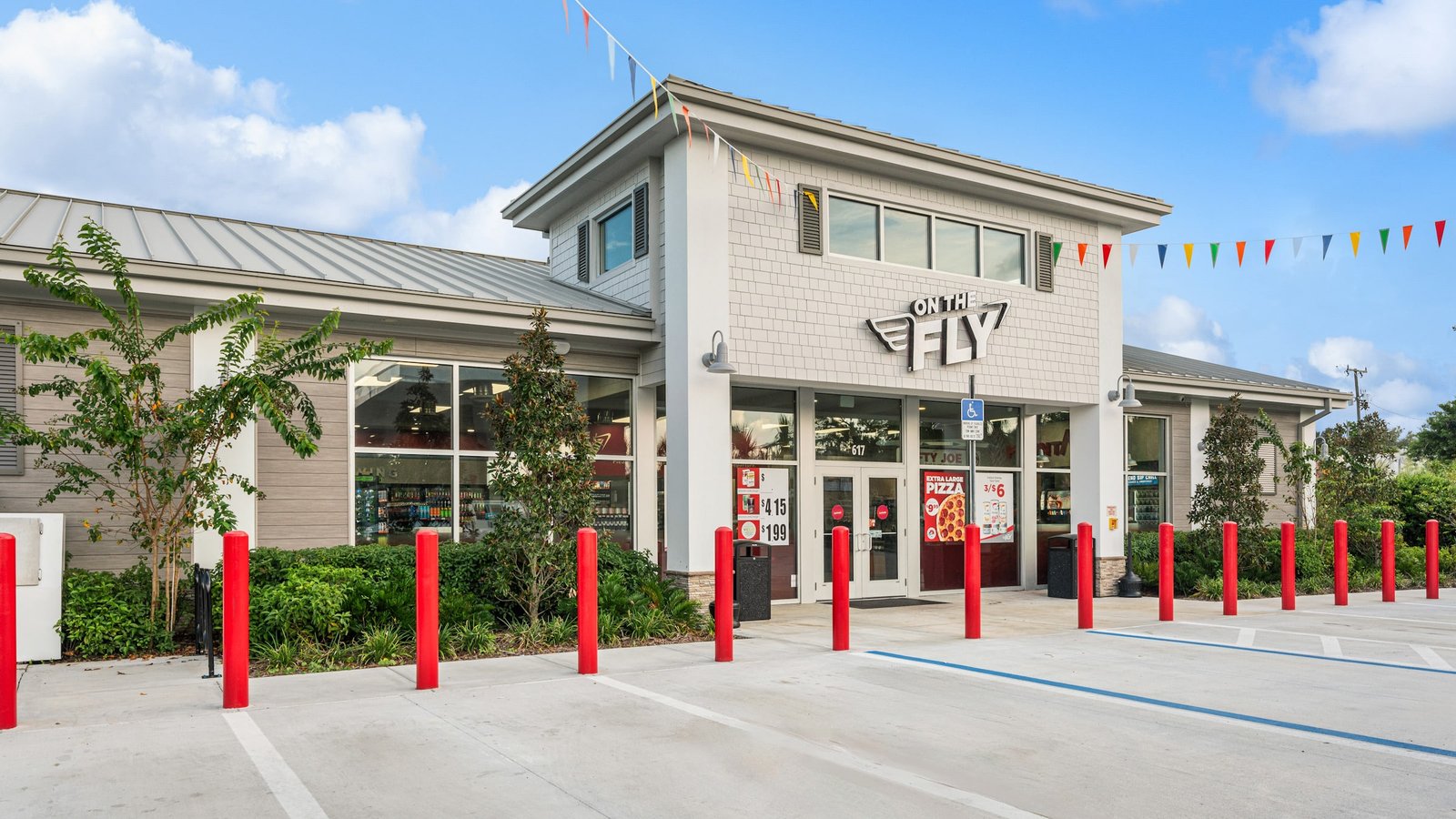
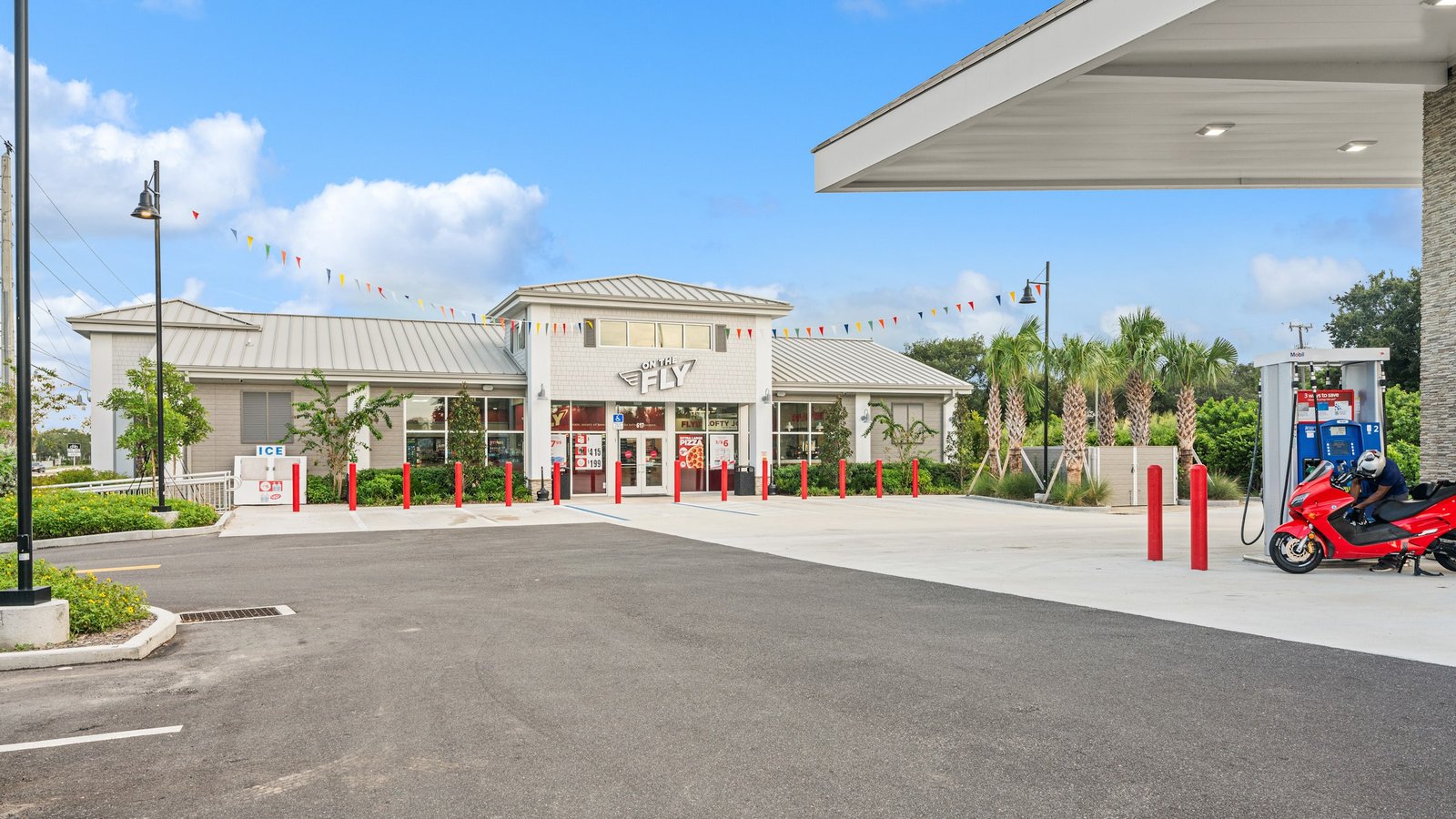
Store Exterior
The On the Fly exterior pairs a clean contemporary shell with bold branding and a welcoming convenience-store arrival.
VIEW BRIEF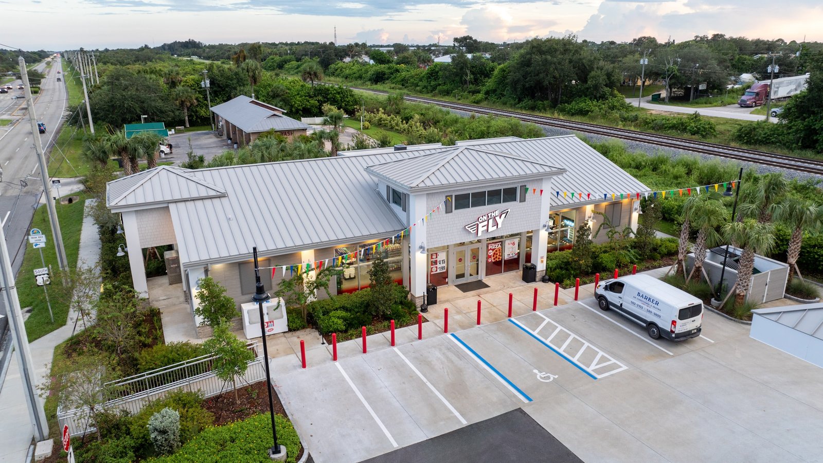
Aerial Exterior
The compact store layout, landscaped site, and prominent On the Fly identity create a polished roadside destination for drivers and travelers.
VIEW BRIEF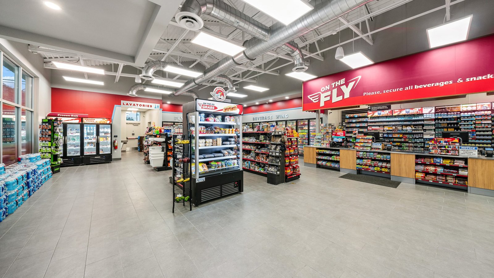
Store Interior
Bright red brand graphics, warm wood finishes, and open sightlines create an efficient but inviting shopping environment.
VIEW BRIEF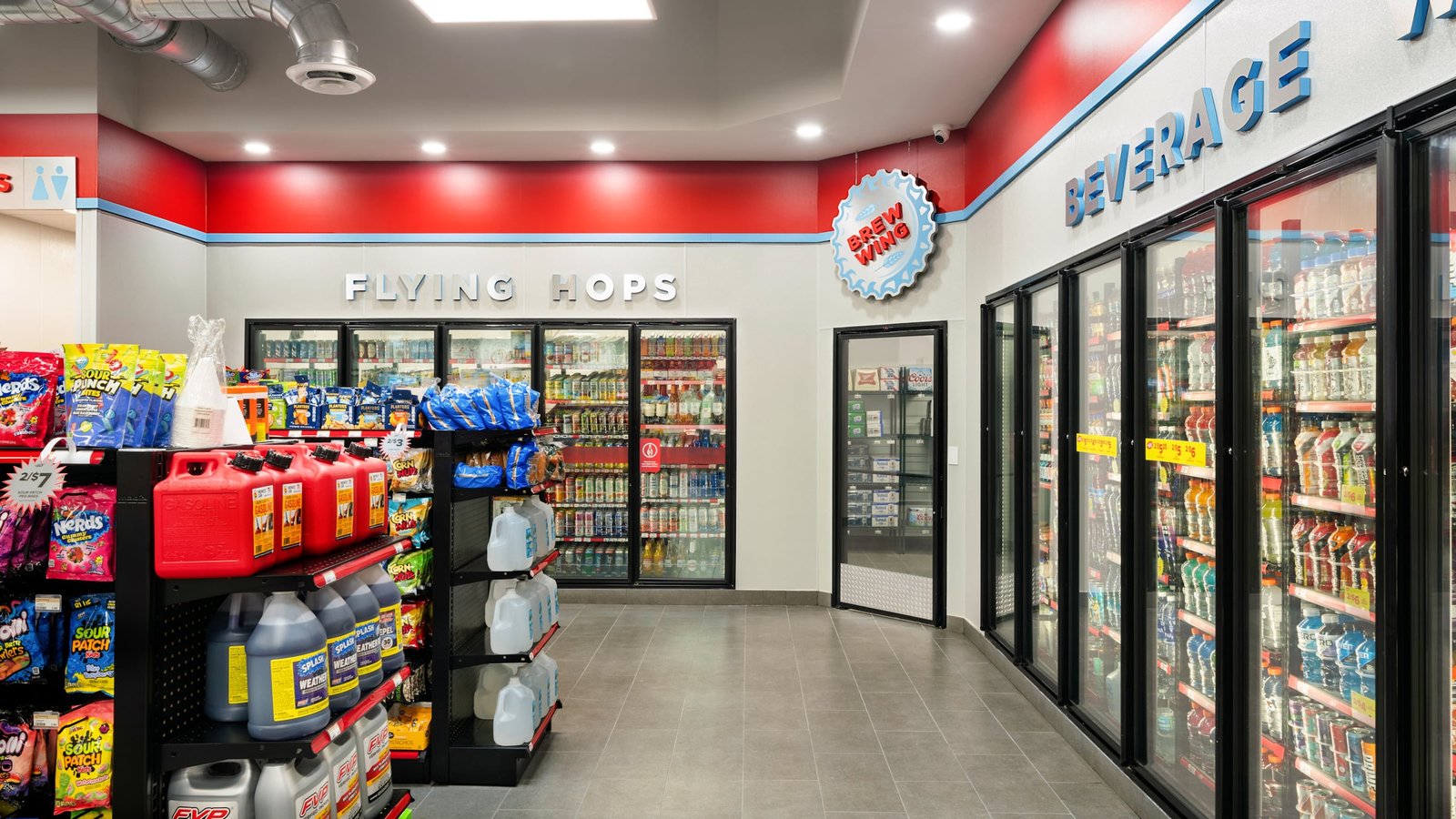
Beverage Wing
Clear dimensional signage and coordinated refrigerated merchandising make drinks easy to locate while reinforcing the aviation-inspired theme.
VIEW BRIEF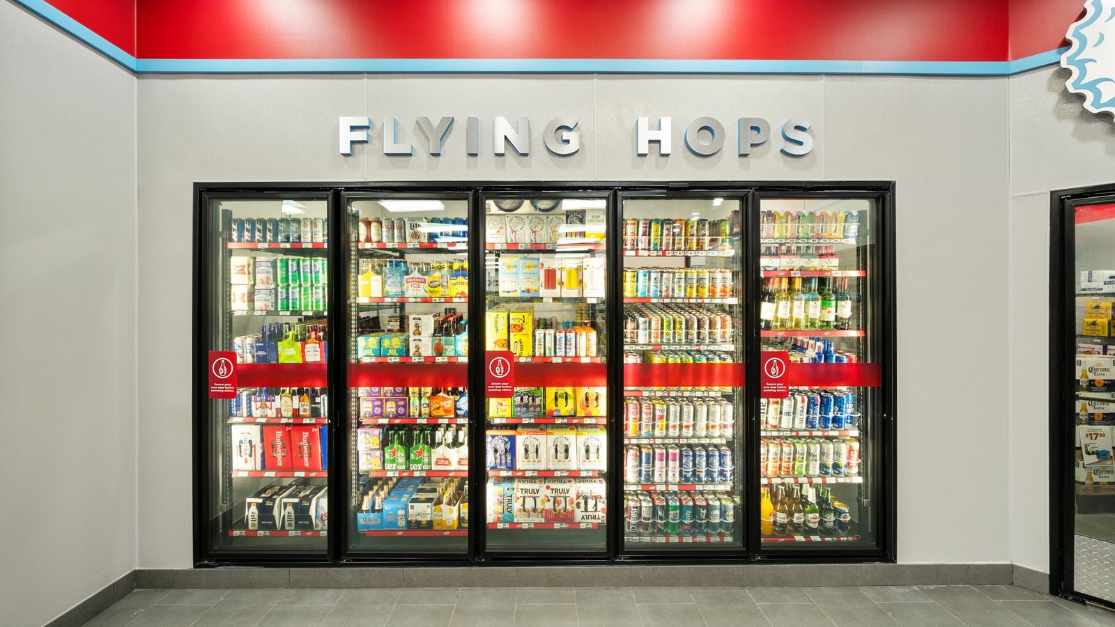
Flying Hops
Playful “Flying Hops” branding turns the refrigerated beer section into a distinctive destination within the store.
VIEW BRIEF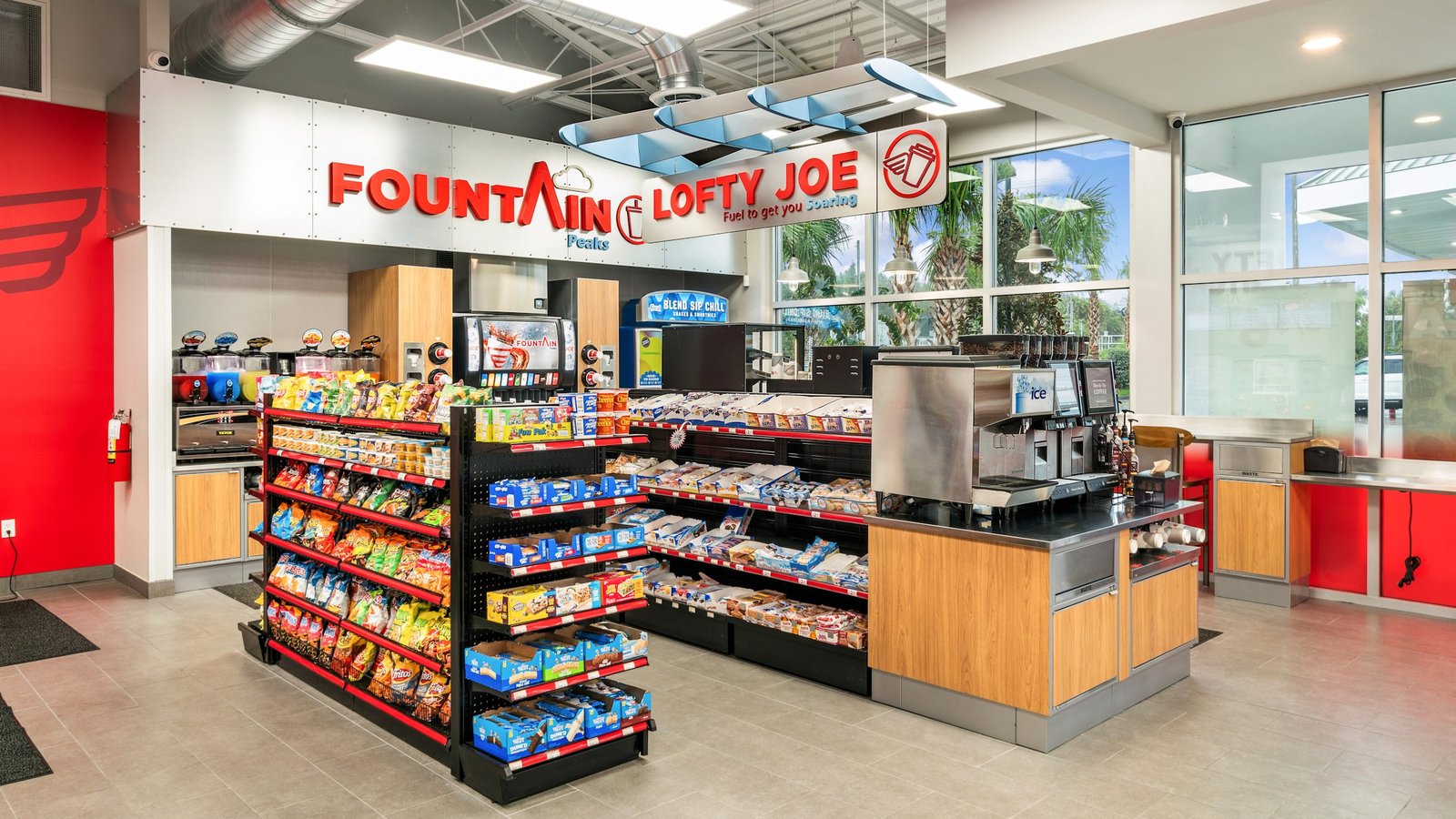
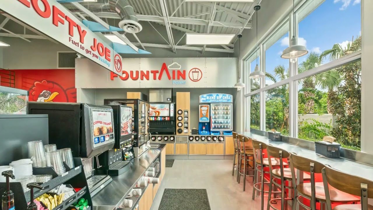
Lofty Joe
The Lofty Joe coffee and fountain area combines aviation-inspired graphics, stainless steel, and wood finishes into a memorable beverage stop.
VIEW BRIEF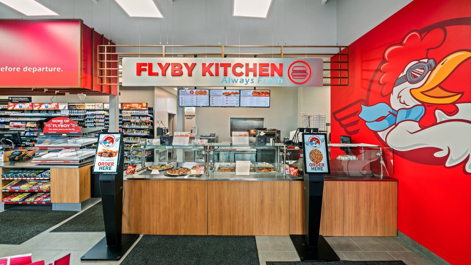
Flyby Kitchen
Bold Flyby Kitchen signage, digital menus, and a vibrant character mural give prepared foods a strong branded presence.
VIEW BRIEF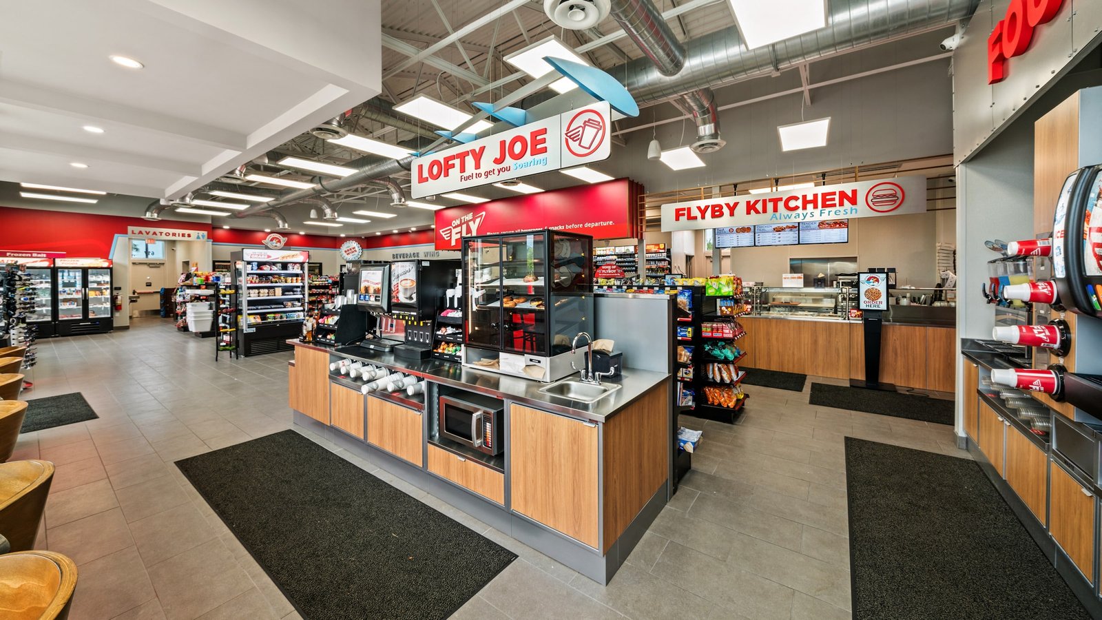
Foodservice Hub
Lofty Joe, Flyby Kitchen, and Fountain Peaks come together in a coordinated food-and-beverage zone designed for quick, convenient stops.
VIEW BRIEF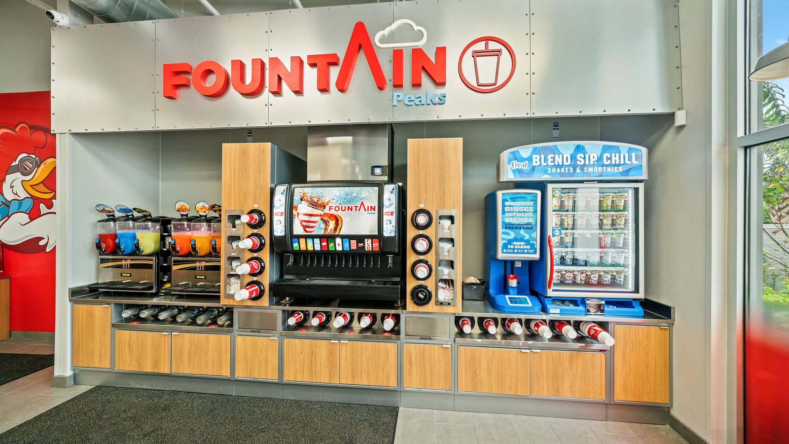
Fountain Peaks
Custom signage and integrated beverage equipment turn the fountain station into a clearly defined branded feature.
VIEW BRIEF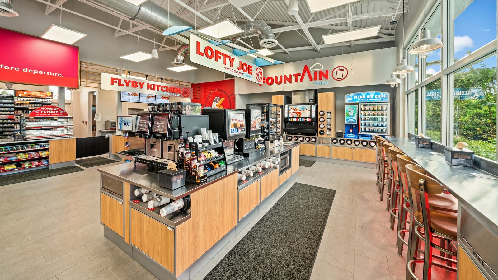
Coffee & Drinks
A centralized beverage island combines coffee, fountain drinks, smoothies, and seating within a compact, efficient layout.
VIEW BRIEF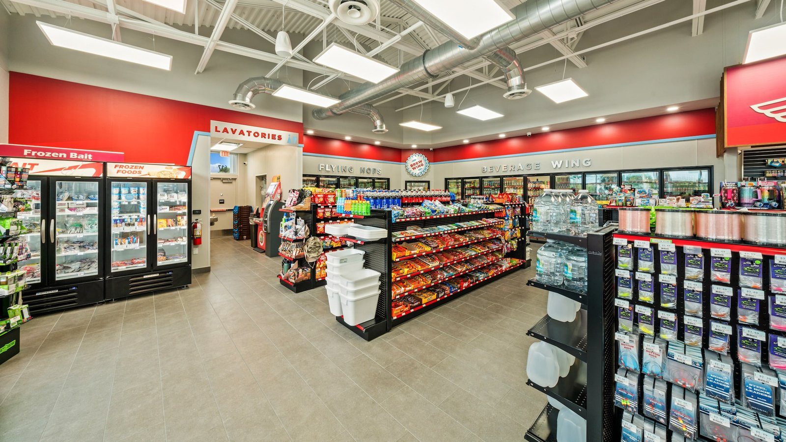
Convenience Floor
Clear department signage, open circulation, and organized merchandising help customers quickly find drinks, snacks, frozen foods, and other essentials.
VIEW BRIEF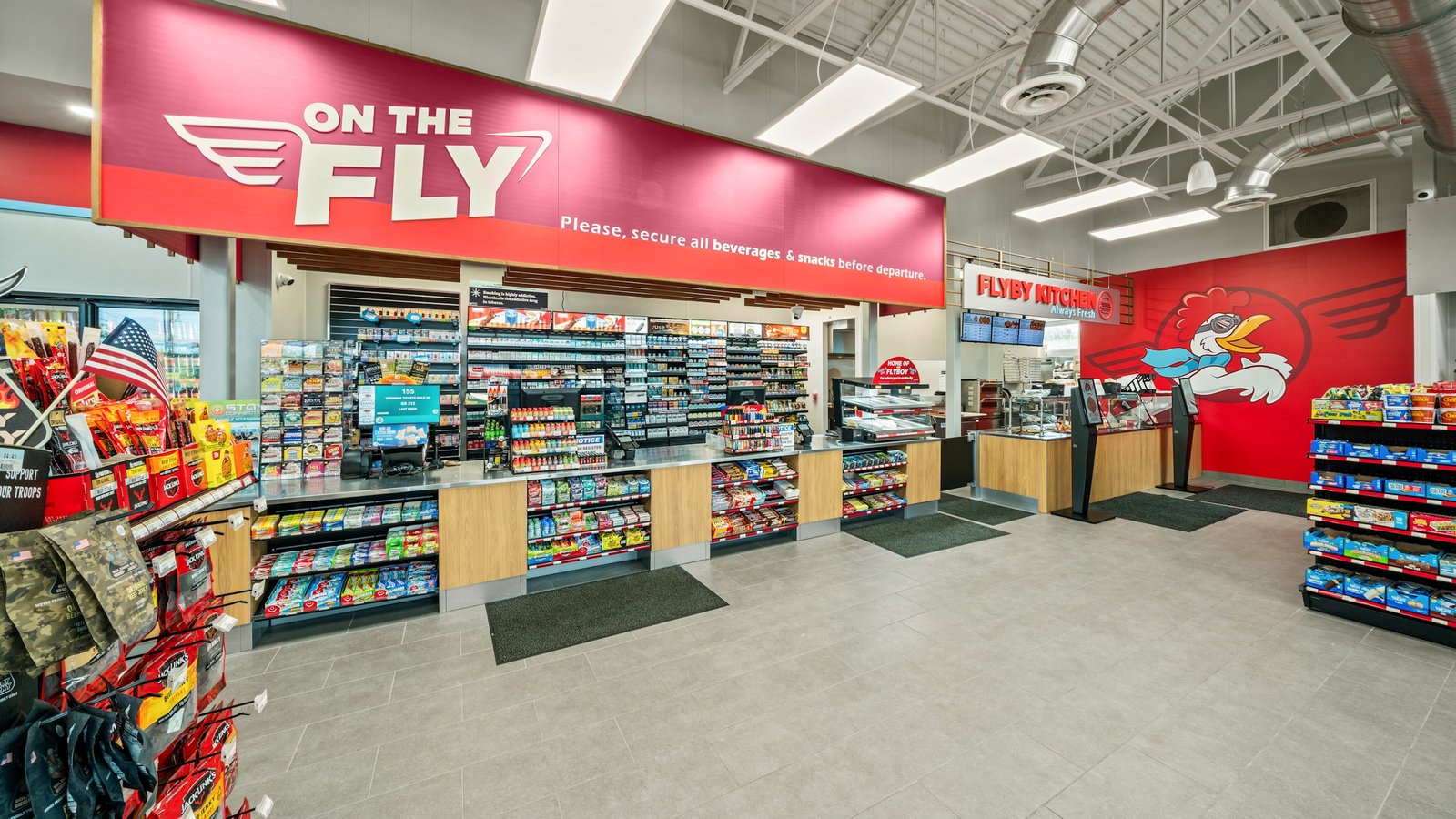
Checkout & Food
The main checkout and Flyby Kitchen share a cohesive visual language of bold reds, warm woods, and streamlined service fixtures.
VIEW BRIEF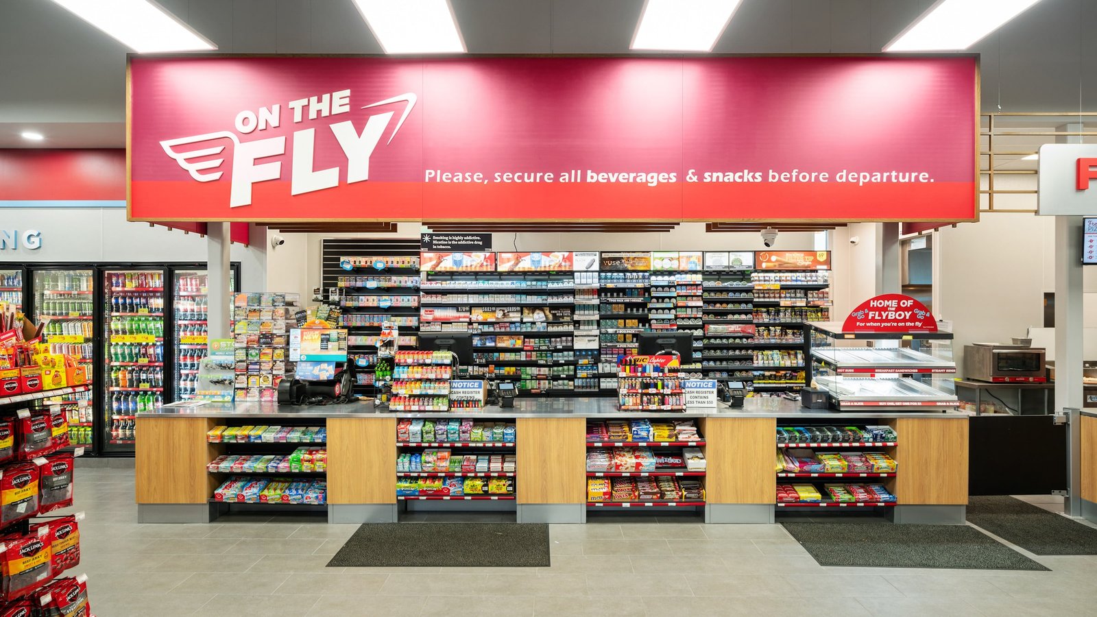
Checkout Counter
A large On the Fly graphic anchors the checkout area while warm wood and streamlined fixtures support fast customer transactions.
VIEW BRIEFTHE BRIEF
At On the Fly, it’s all about giving the customer what they need to keep moving—whether that’s a quick snack, a fresh meal, or just a place to refuel, both for their car and themselves. It’s designed to be efficient, but warm, so the customer can feel right at home while grabbing what they need to keep soaring.
Inspired by Giant Oil’s On the Fly brand for their convenience stores, King Retail Solutions developed a concept that seamlessly blends retro air travel aesthetics with a modern twist. Drawing from the iconic TWA terminal by Eero Saarinen, the design incorporates the rich reds, burgundies, and whites of the classic terminal, with lively pops of teal for a fresh, dynamic feel.
THE OUTCOME
The space evokes the nostalgia of the golden age of air travel while maintaining a clean, contemporary look. Simple geometries, sweeping graphic forms, and a minimalist material palette—featuring warm mid-tone woods and stainless steel—create a welcoming yet sleek environment. It’s a place where the design not only looks great but also serves a functional purpose, providing the essentials for busy travelers or locals in need of a quick stop.
Discover how King Retail Solutions transformed convenience store design with Giant Oil’s "On the Fly" concept.