
PriceRite Marketplace project hero image
← All work

PriceRite Marketplace

A marketplace design feeling both fresh and familiar

Client
PriceRite Marketplace
Shown
Waterbury
Services
Design • Décor Fabrication • Installation Services
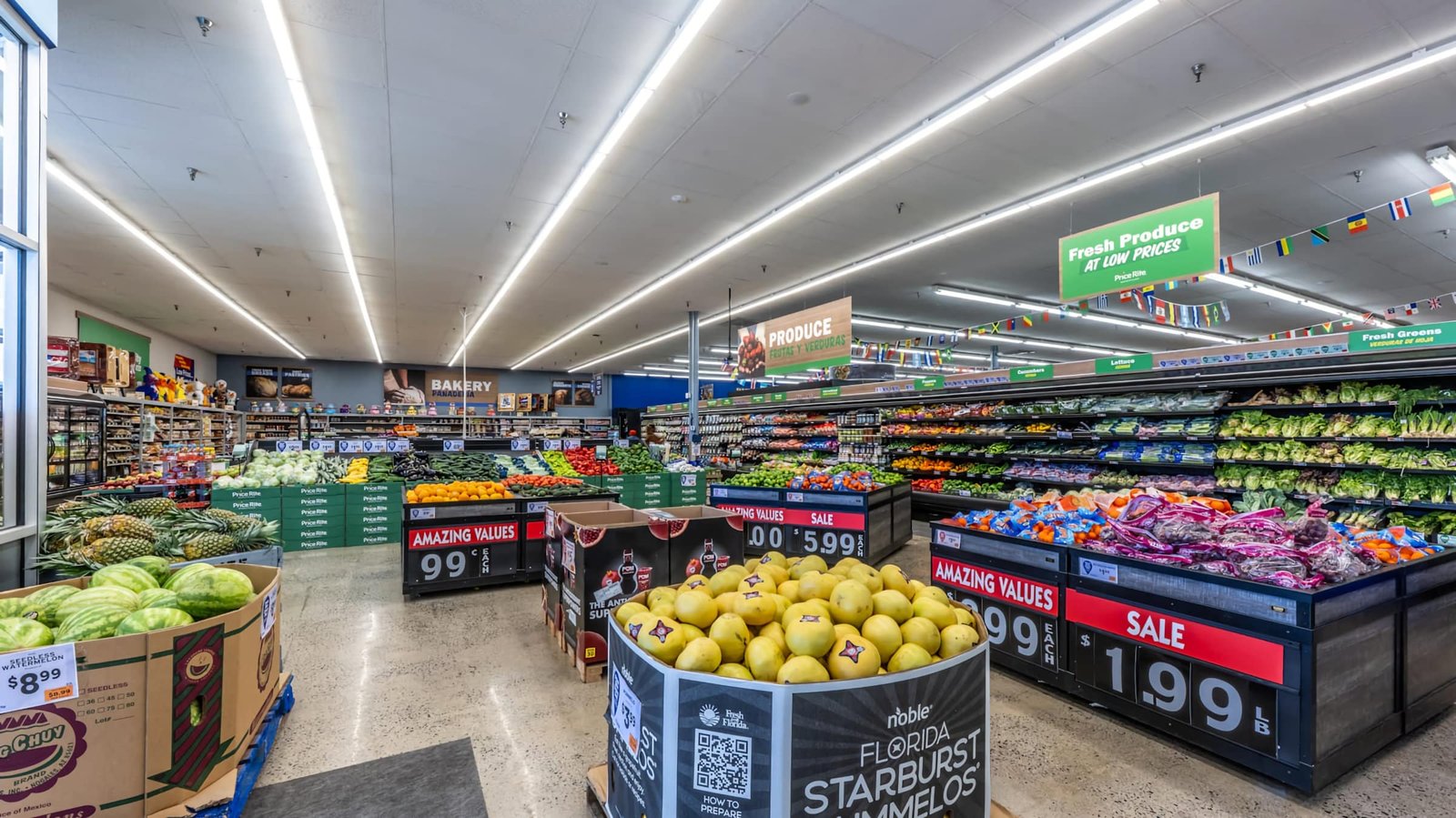
Bold department graphics, bilingual signage, and value messaging give the produce area a fresh, easy-to-shop identity.
Fresh Produce: Bold department graphics, bilingual signage, and value messaging give the produce area a fresh, easy-to-shop identity.

Fresh Produce

Bold department graphics, bilingual signage, and value messaging give the produce area a fresh, easy-to-shop identity.

VIEW BRIEF
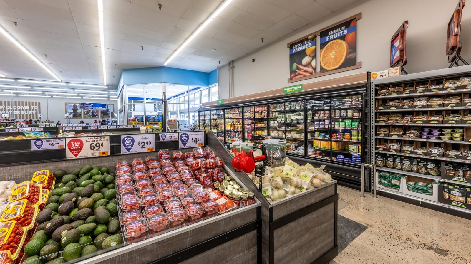
Warm wood accents and prominent fresh-food imagery help define produce while reinforcing PriceRite Marketplace’s approachable value focus.
Produce Market: Warm wood accents and prominent fresh-food imagery help define produce while reinforcing PriceRite Marketplace’s approachable value focus.

Produce Market

Warm wood accents and prominent fresh-food imagery help define produce while reinforcing PriceRite Marketplace’s approachable value focus.

VIEW BRIEF
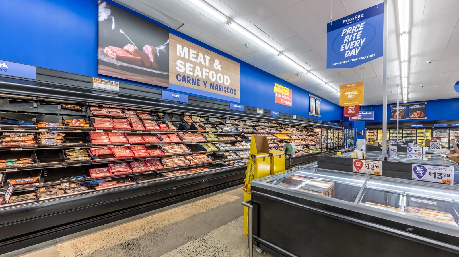
Large-scale bilingual department signage and bold blue finishes create a clear, highly visible destination for meat and seafood.
Meat & Seafood: Large-scale bilingual department signage and bold blue finishes create a clear, highly visible destination for meat and seafood.

Meat & Seafood

Large-scale bilingual department signage and bold blue finishes create a clear, highly visible destination for meat and seafood.

VIEW BRIEF
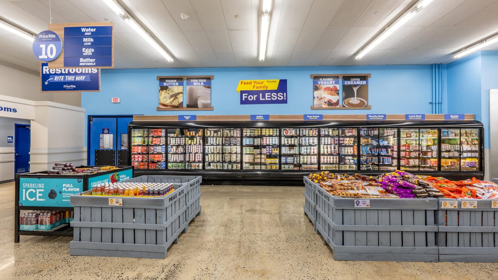
Coordinated signage, product imagery, and category markers improve navigation through dairy while keeping value messaging front and center.
Dairy Department: Coordinated signage, product imagery, and category markers improve navigation through dairy while keeping value messaging front and center.

Dairy Department

Coordinated signage, product imagery, and category markers improve navigation through dairy while keeping value messaging front and center.

VIEW BRIEF
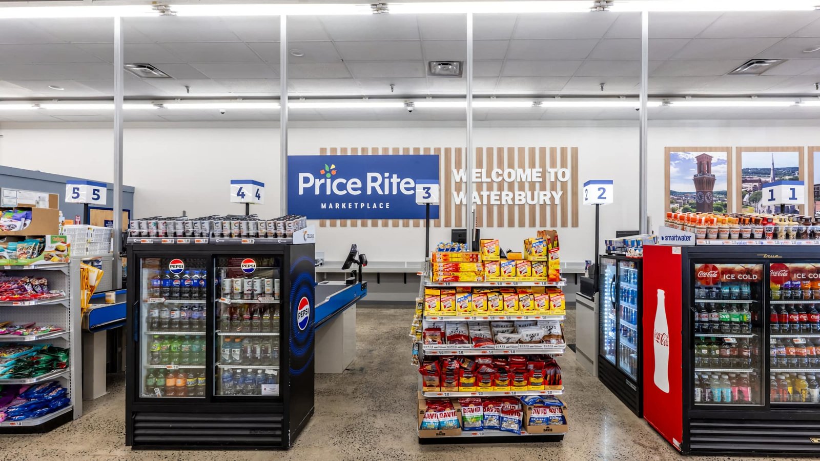
Localized “Welcome to Waterbury” graphics create a strong community connection within the PriceRite Marketplace shopping experience.
Waterbury Entry: Localized “Welcome to Waterbury” graphics create a strong community connection within the PriceRite Marketplace shopping experience.

Waterbury Entry

Localized “Welcome to Waterbury” graphics create a strong community connection within the PriceRite Marketplace shopping experience.

VIEW BRIEF
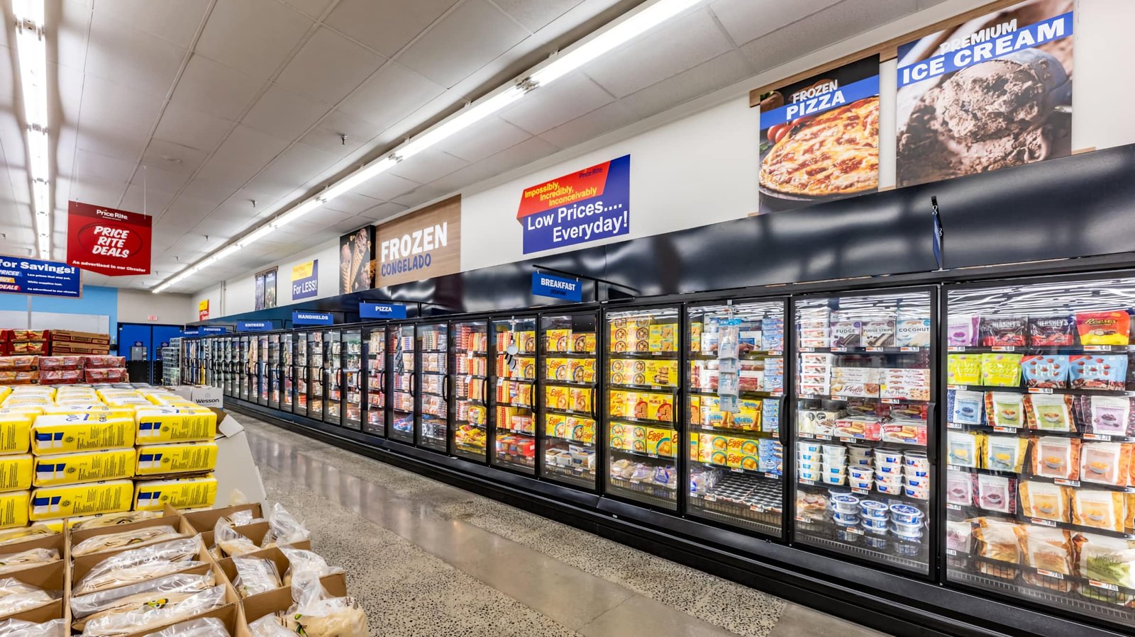
Clear category signage and branded promotional graphics organize the expansive frozen section for faster, more intuitive shopping.
Frozen Foods: Clear category signage and branded promotional graphics organize the expansive frozen section for faster, more intuitive shopping.

Frozen Foods

Clear category signage and branded promotional graphics organize the expansive frozen section for faster, more intuitive shopping.

VIEW BRIEF
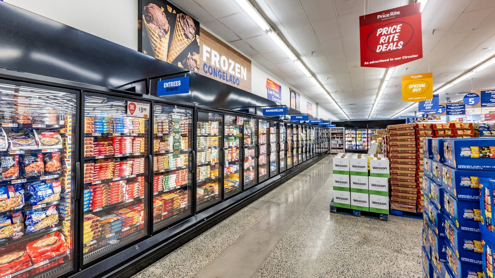
Layered department graphics, promotional messaging, and consistent blue accents bring energy and clarity to the frozen food aisle.
Frozen Aisle: Layered department graphics, promotional messaging, and consistent blue accents bring energy and clarity to the frozen food aisle.

Frozen Aisle

Layered department graphics, promotional messaging, and consistent blue accents bring energy and clarity to the frozen food aisle.

VIEW BRIEF
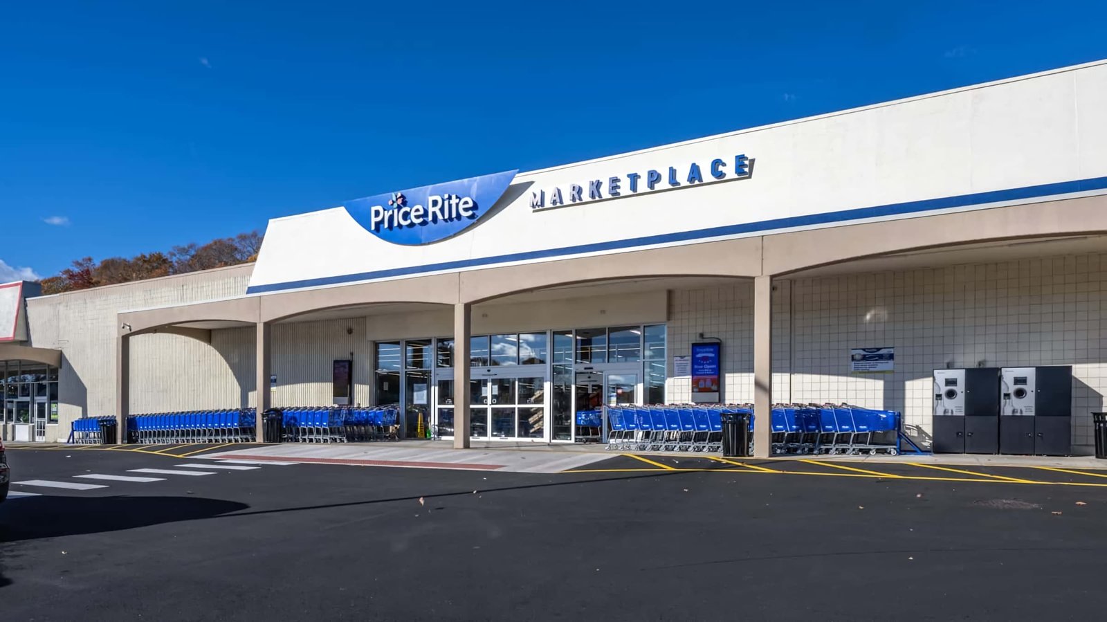
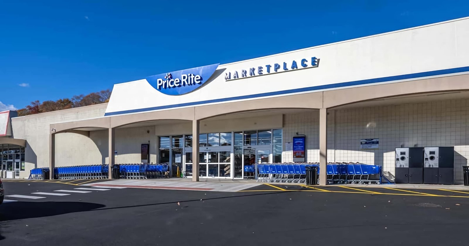
Refreshed PriceRite Marketplace branding creates a clean, recognizable storefront presence for the Waterbury location.
Store Exterior: Refreshed PriceRite Marketplace branding creates a clean, recognizable storefront presence for the Waterbury location.

Store Exterior

Refreshed PriceRite Marketplace branding creates a clean, recognizable storefront presence for the Waterbury location.

VIEW BRIEF

THE BRIEF

KRS elevated the value-driven grocery experience at the Waterbury location of PriceRite Marketplace through a vibrant new color palette and refined material selections. The marketplace design updates enhance visual appeal while maintaining the store’s approachable, price-forward character.

The design centers on simplified signage and graphics that improve wayfinding and pricing clarity. Color is used strategically to define departments and guide the shopper journey. Bold brand moments and thoughtfully selected imagery add energy throughout the space, creating an experience that feels both fresh and familiar.

THE OUTCOME

A marketplace design that enhances clarity, boosts visual energy, and strengthens the shopper experience while staying true to the approachable, price-forward character of PriceRite Marketplace.